
Painting tones
Recap for classes at SARAH Hall and Orrell.
Using only two colours and white, I’ve used ultramarine blue and burnt sienna. Burnt sienna is like a really dark orange or complementary colour to the blue. Some colour matches will be possible. For instance if the tone leans toward cool blue or warm brown I can approximate them but I’m really interested in getting the tonal relationships in place
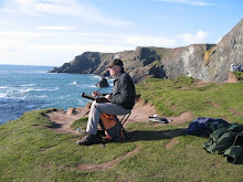
Find a photograph to copy the tones (not the colour). Colour supplements or catalogues offer a good range of figure studies.
Map out a plan for the painting and block in the main shapes laying in the dominant tones (not colour)
Keep squinting at the picture to get the right tone is good for seeing the relationship between values but not colour.
Keep things simple and avoid any detail. Think back to the paintings of Peggi Kroll Roberts who we looked at last week.
Some tips from Richard Schmid
Squint down until most of the detail disappears and what you are looking at can be seen in a few shapes
The purpose of squinting is to make judgements about the relationships between the values not he actual shades. You are looking for relationships.
Step back from what you’ve painted, view it from a distance to see the value relationships clearly and see what may need adjusting.
The fewer clear cut values in a painting the more powerful the visual effect.
Simplify what you see.
Now you try again at home and simplify with another photograph
Recap for classes at SARAH Hall and Orrell.
Using only two colours and white, I’ve used ultramarine blue and burnt sienna. Burnt sienna is like a really dark orange or complementary colour to the blue. Some colour matches will be possible. For instance if the tone leans toward cool blue or warm brown I can approximate them but I’m really interested in getting the tonal relationships in place
Find a photograph to copy the tones (not the colour). Colour supplements or catalogues offer a good range of figure studies.
Map out a plan for the painting and block in the main shapes laying in the dominant tones (not colour)
Keep squinting at the picture to get the right tone is good for seeing the relationship between values but not colour.
Keep things simple and avoid any detail. Think back to the paintings of Peggi Kroll Roberts who we looked at last week.
Some tips from Richard Schmid
Squint down until most of the detail disappears and what you are looking at can be seen in a few shapes
The purpose of squinting is to make judgements about the relationships between the values not he actual shades. You are looking for relationships.
Step back from what you’ve painted, view it from a distance to see the value relationships clearly and see what may need adjusting.
The fewer clear cut values in a painting the more powerful the visual effect.
Simplify what you see.
Now you try again at home and simplify with another photograph


No comments:
Post a Comment