Showing posts with label acrylic alla prima. Show all posts

Wednesday, 11 June 2014

SARA Art Class


After Will Kemp

Posted for the painting in acrylics class at SARA Hall.

I can thoroughly recommend you visit Will’s site as he’s very forthcoming with his knowledge of painting. There are some excellent resources there for you to supplement your painting lessons and if you subscribe to his newsletter, he’ll keep you posted on any updates. Why not take a look; I’m sure you’ll be impressed. Follow the link below:

Monday, 24 February 2014

After Frank Serrano


23 cm x 30 cm acrylic on paper
Tuesday art classes at SARA Hall and Orrell.

Using an oil painting by Frank Serrano, we will use only ultramarine, burnt umber and white to explore contrast of temperature. It's amazing the range you can achieve with so little. See more of his work on

http://serranofineart.blogspot.co.uk

Monday, 10 February 2014

After Craig Nelson


 Acrylic study after Craig Nelson for the painting classes at Orrell and SARA Hall, I was asked to post it last week and forgot, sorry.

Saturday, 28 December 2013

Cadgwith Cove.


27 cm x 15 cm acrylic on card

I'm giving some new brushes a test run for an upcoming article I'm writing for Leisure Painter magazine. I used a fluorescent orange paint for the floats on the side of the boat and try as I might the colour wont scan when every other is fine.

Sunday, 17 November 2013

After Susan Lyon


Both studies 24 cm x 19 cm acrylic on paper.


Practice at painting edges and keeping the paint loose and clean, painted roughly in the style of the excellent Susan Lyon. I have to say its quiet challenging in acrylics as opposed to oils as you have to work quicker to maintain the integrity of the edges.


Wednesday, 13 November 2013

Life Class


30 min colour study acrylic on paper 22 cm x 28 cm

Thursday, 7 November 2013

Life Drawing


Acrylic on paper 28 cm x 30 cm .

It's ever so tempting to join in and paint for 3 hours at the life class, but I enjoy these 15 minute studies as I teach.

Wednesday, 31 July 2013

Published in Leisure Painter magazine


I have two articles in the August edition of the Leisure Painter magazine out now. The first is the last in a four part series on using acrylics, this time like oils in a full demonstration. The second is how to manage your time on a family holiday and still get some painting done while you're away.


Tuesday, 30 July 2013

Sennen Beach Study

24 cm x 17 cm acrylic on paper

Another study from Cornwall, this time painted from a beach tent ( a great outdoor studio) on Sennen Beach. A steady wind towards the end of the painting forced me to stop as it was like painting on sandpaper and in the paint on the palette. I managed to scrape most of it off but some is there for good on the picture...lets call it texture. I painted the girl in back home from photos and drawings.


My son and daughter enjoy the outdoor studio after a surfing session

Monday, 29 July 2013

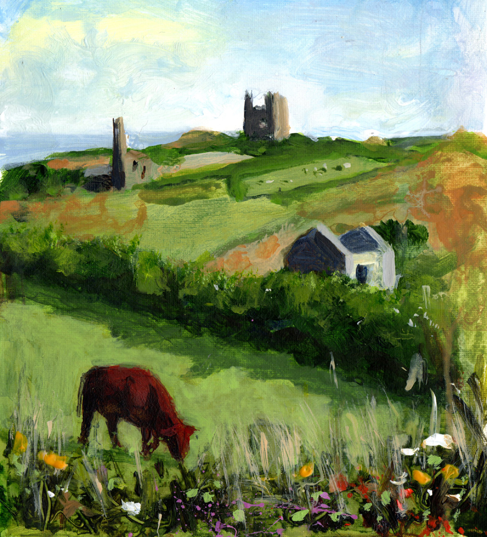
No.11 Pednandrea St.Just II


15 cm x 18 cm acrylic on paper. 

Another of the views from the back decking. I added the cow at home, as slow moving as they are they're easier to draw quickly than paint.

Sunday, 28 July 2013

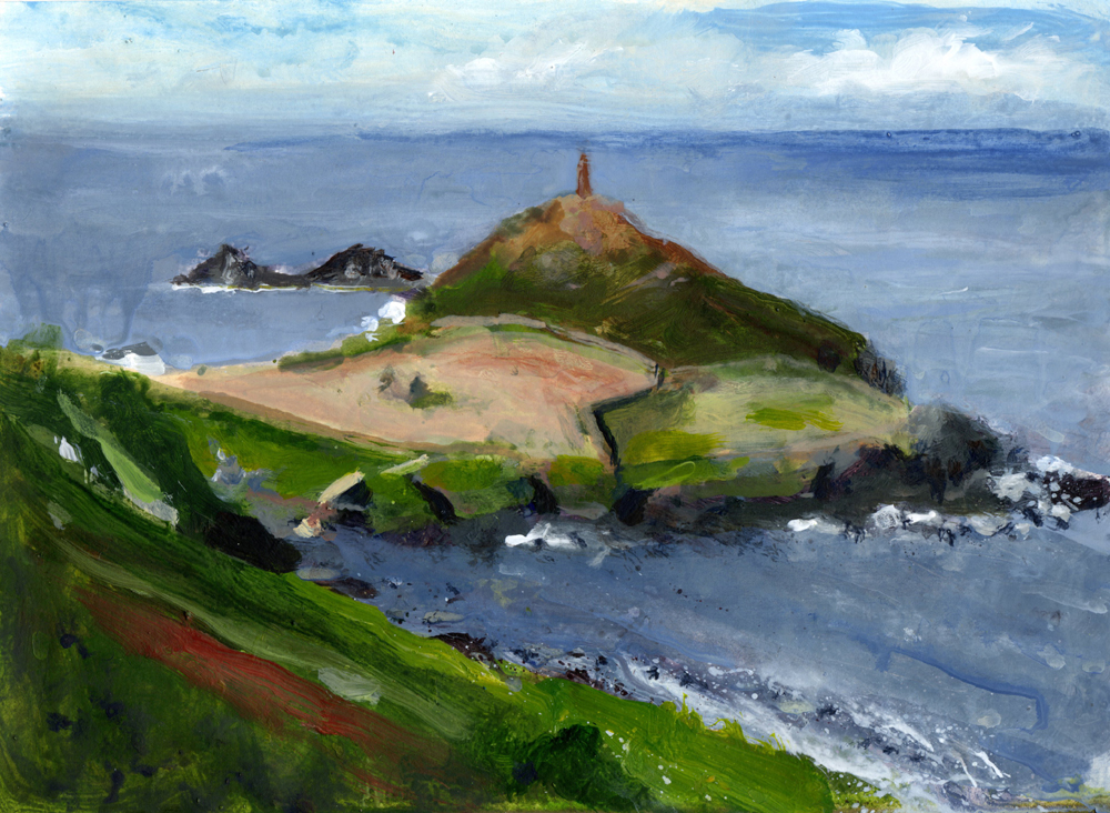
Cape Cornwall


24 cm x 17 cm acrylic on paper


How big do I paint outdoors? If it fits in the lid of the box I'm good to go. I spent a quiet morning painting at the Cape being serenaded by seven seals in the bay. 

Saturday, 27 July 2013

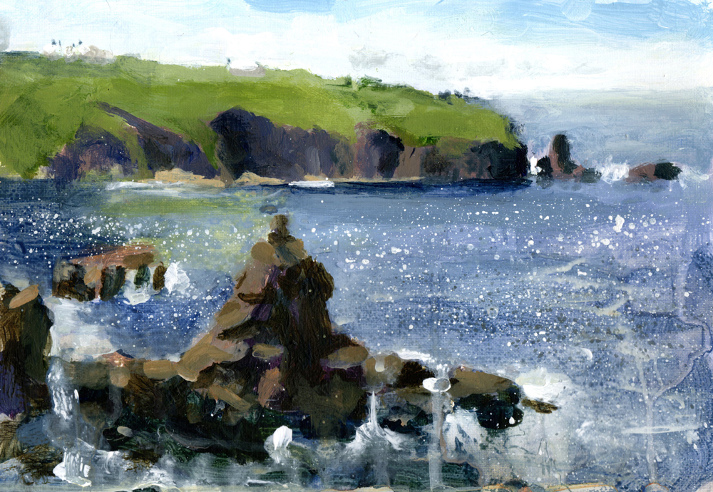
Lands End


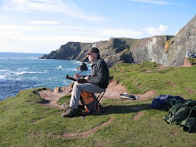
I Had a nice afternoon painting on the cliffs between Sennen Cove and Lands End. A short walk was all it took to get away from a sea spiked with the squeals of summer bathers. A precarious spot on the cliffs kept me out of view from all but two curious sightseers.

Friday, 26 July 2013

No.11 Pednandrea. St. Just, Cornwall.


10 cm x 11 cm acrylic on canvas paper.

Just back from a weeks family holiday in Cornwall where we caught the tail end of the good weather. This little study was from the balcony of our lovely getaway in St. Just looking to Cape Cornwall.

Saturday, 22 June 2013

Kynance Cove II. Painting From Photographs.


29 cm x 20 cm acrylic on watercolour paper

SOLD

We were working from photographs in class this week and I used this picture from a much visited site I have painted at many times in Kynance Cove Cornwall.


Why paint from photographs at all?
Photographs are a great reference as to what was actually there and can so often be the only way of recording what may have been a fleeting effect. The subject could be moving so fast, the lighting conditions fading quickly, or the opportunity to paint just not possible.
Use your own photos.
Using other people’s photographs lacks so many other additions to the scene. You were never there and the photograph is all you have to go on, at most your painting will be a competent copy. A photograph cannot call to mind the experience, the smells, the sounds and the weather that all go into the creation of a piece of work. I still recall these experiences from looking at many of my outdoor paintings, but find it hard to remember even snapping a photo
Don’t be a slave to copying.
Lose the detail, alter the edges, colour, tones and shift around the composition to suit the painting not the photograph. Don’t feel the need to copy everything. Shadows and light can be bleached and black. True colours and contrast are easily lost in the cameras effort to record light and dark.  If you are you are using the camera to gather information to paint at a later date, it’s a good idea to make notes or do quick colour studies as well.
Set yourself a time limit
I find this to be one of the most important things to do if I have to use a photograph. If I paint outdoors I know I’m usually done in a couple of hours. However the temptation with a photograph is to keep going because the weather or the light is not changing. The shadows are not going to disappear, or the colour and values alter. Don’t be tempted to take your time, chances are the painting will become overworked with far too much detail and lose any vitality you strived to attain.

Saturday, 11 May 2013

Mousehole


This painting is part of a step by step demonstration. The last in a four part series for Leisure Painter magazine, part one is out now in the June edition.

Monday, 25 March 2013

Tuesdays Lesson.


Tuesday classes at SARAH Hall and Orrell 


This week I want to use a full palette of warm and cool primaries and attempt to paint in the style of Peggi Kroll Roberts, http://www.krollroberts.com I like the simplicity of Peggi’s work, but don’t confuse simple with easy.

Lay out your palette first and don’t skimp on the paint. For the example shown I used
Cobalt blue, ultramarine blue, cadmium red, crimson red, cadmium yellow, lemon yellow and white.

As a general breakdown of the colours used I laid in cobalt blue for the background and ultramarine for the shadow; adding the compliment is one way to take down a colour in the shadows but if you have a darker value  of the same colour try that first. For instance the mid blue cobalt has the dark blue ultramarine for the shadow. Similarly with red, cadmium in the light could use crimson in the shadows. Both these examples will give a cleaner shadow colour, give it a try.

From left to right the fruits were cadmium yellow; cadmium yellow and cadmium red to make orange and lemon yellow.

Take them into shadow this time using the complementary of each colour.

The dark background on the left is a rich dark brown; make your own using a mix of three primaries, ultramarine blue, crimson and cadmium yellow.

The teapot is a little of the same mix added to white; you may need to adjust it to get a greyer mix without any obvious colour dominating.

The green foreground is cadmium yellow and ultramarine blue, and remember the shadows are a darker green, not black.

The other part of the foreground was crimson red and ultramarine blue added to white.
Remember when mixing add the dark to the light. Don’t over mix the paint and use as few brushstrokes as you need. Use a swatch.

Monday, 25 February 2013

Using Acrylic Like Watercolour


I've been playing with the acrylics and using them like watercolour to get into the swing of things for an upcoming article for the Leisure Painter. I did a copy of a recent still life in oils I did, ‘Pomegranate and Grapes’, and brightened up the backdrop.


Sunday, 17 February 2013

Using Acrylic Paints Like Watercolour


20 cm x 16 cm acrylic on 140 lb watercolour paper.

Using acrylic paint in a watercolour technique. An illustration for a forth coming article with Leisure painter magazine.

Wednesday, 6 February 2013

Mersey


19 cm x 14 cm acrylic on canvas
A commission of an earlier painting.